Case Study
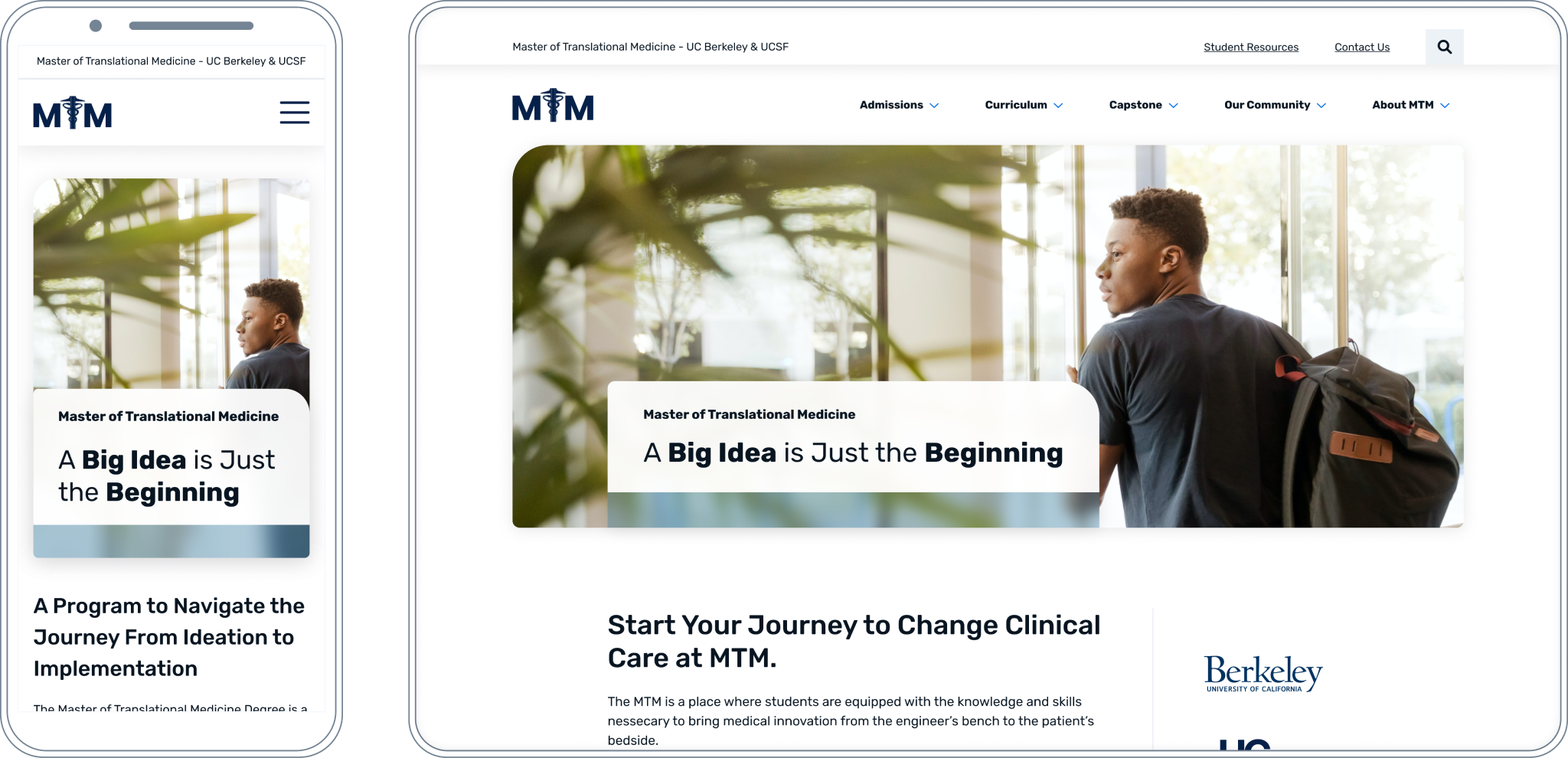
Master of Translational Medicine – UC Berkeley & UCSF
Starting with audience discovery to build a website that highlights user values.
The Master of Translational Medicine Program is a one-year graduate program that blends medical innovation and entrepreneurship with clinical application. Students benefit from a unique two-campus partnership that brings together the best of a UC Berkeley and UCSF education.
Services Provided
Our Approach
The Challenge
The MTM team knew they were ready for a new website with an elevated and modern look and feel.
When they met with our team, they grew interested in stepping back even further and exploring whether the content on the existing website was successfully addressing the questions that prospective students commonly have.
Knowing that user experience could directly impact their website’s conversion of new student applicants, this pre-design research become a critical component of the process.
The Solution
Together we created a plan to collect feedback directly from site users. We started by reviewing target audience data, then carried out a series of user interviews that resulted in an audience discovery brief.
We learned that while their current website clearly detailed their program, it lacked the point of view of a prospective applicant. The prospective applicant is looking for value propositions that balance the significant time and cost investment of the program.
With these findings, we were able to create a new sitemap and organize content in a way that highlights these value propositions and fills in the missing gaps.
Key Actions
Results
The MTM Executive Director, Moose O’Donnell, summed up his experience with our team in this way: “The team made a real effort to understand our business and what makes us unique. It was a pleasure to talk to them about what we wanted on our website because they seemed so interested in the process. Their market research confirmed a lot of things we already thought we knew, but also drew out new insights and articulated them in helpful ways. Overall, the creative process was a lot of fun.”
See the Work

Project Journey
-
Discovery
- 1. Competitor Analysis
- 2. User Interviews
- 3. Vision Statement
- 4. Content Inventory
-
Design
- 5. Sitemap
- 6. Wireframes
- 7. Homepage Mockups
- 8. Secondary Mockups
-
Development
- 9. Task Refinement
- 10. Prototype Build
- 11. Feature Build
The team at Linea Creative made a real effort to understand our business and what makes us unique. It was a pleasure to talk to them about what we wanted in our website because they seemed so interested in the process. Their market research confirmed a lot of things we already thought we knew, but also drew out new insights and articulated them in helpful ways. Overall, the creative process was a lot of fun.
Moose O’Donnell
Executive Director
Master of Translational Medicine


